This is the first devlog for Kindie.
Kindie is a Taiwan preschool information platform: fees, maps, penalty records, and parent reviews for more than 7,000 preschools across the country, all in one place, so parents can compare them side by side. It officially launched on April 7, 2026, and the first week left behind a complete trail — Threads post insights, Plausible traffic reports, and real feedback from parents on Threads.
This entry is a look back at how it got here: why I built it, how, what happened that week, and where it might head next. Beyond that, I want to write down some of the judgment calls as they were made, so that when I look back later, I'll know what I was thinking at the time.
The Problem
Looking back at the stretch when we were searching for a preschool for our kid: my wife already knew this world inside out — the preschools, their reputations, how the districts worked — while I was mostly in the dark. I didn't know how to read a district, what separated private, quasi-public, and public preschools, or what each one cost. I had to look everything up one by one, take notes, and compare them one by one.
And beyond those basics, what my wife and I cared about most was safety.
We kept searching the web for whether a given preschool had ever been penalized, or had shown up in negative news. Because under the current rules, once a penalty record has been improved within its deadline, it can no longer be viewed on government sites. The government presumably wants to protect operators' rights and reputations — but for a parent, the fact that an incident has been settled doesn't mean things are fine, or safe, now.
I can't help complaining about these rules — they always feel like they protect the offender rather than the victim. But that's a digression.
Our flow looked roughly like this: a dozen browser windows — the Ministry of Education's national ECEC portal for fees and penalty records, Google Maps for locations and reviews — and finally a spreadsheet where we copied everything in, cell by cell, to compare. All of the data is public; it's just scattered across different places, and nowhere lets you put it side by side.
What we wanted was actually very concrete: fees, location, penalty records, reviews — on one page, check off a few preschools, compare them side by side. That's it.
So I spent a few months of weekends building it.
The Data
Kindie's data comes from the public datasets on the Ministry of Education's national ECEC portal; for penalty records, it stands on the public repo that kiang has been crawling and maintaining for years — thank you.
7,297 preschools across Taiwan. Getting the data isn't the hard part; the details are:
臺 vs 台: The character tái in Taiwan's place names has a formal variant (臺) and an everyday one (台). The official data says 「臺北市」; my code said 「台北市」; and the comparison simply fails — silently. No error message, nothing: records just don't match, sorting comes out wrong. In the end the whole project standardized on 臺 to stay consistent with the source. The kind of problem that never appears in any tutorial, but will quietly eat two hours of your night.
Structural gaps in the penalty data: The public repo has only crawled about five times in three years, so any record taken down between two crawls is simply gone. If a preschool shows no penalties, that doesn't mean there were none — only that there were none at crawl time. That's a limitation of the source, not a bug, and all we can do is label it honestly.
Show everything, annotate everything: Penalty records are probably the information parents care about most — and the most sensitive. Kindie's approach: once a record is collected, it is never deleted; records already taken down from government sites are kept but flagged; and following a rule that took effect in 2023, each record's public-display period is calculated automatically, so parents can tell at a glance whether an issue has been improved or is still within its display window. Better one more annotation than any deletion or edit.
Choices
No suspense on the tech side — collecting and analyzing information is the part I'm actually good at:
- Laravel + Livewire — I've written PHP for a long, long time; the weekends should go into the product, not into learning a new framework
- Flux UI + Tailwind CSS — use the components as-is, and save the design-tweaking time too
- Laravel Cloud — push to deploy, no machines to babysit
Most of the building happened in collaboration with Claude Code: every change is a GitHub Issue with the background, the analysis, the files to touch, and the conditions for done — then I hand it over. My job is the spec, the judgment, and the decisions.
Launch
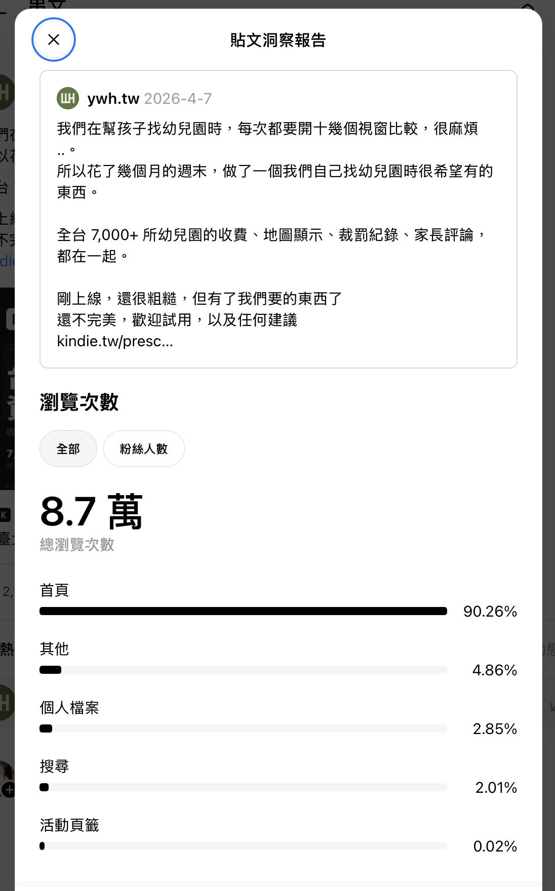
On April 7, I posted on Threads for the first time, under the 媽媽日常 ("mom life") and 幼兒園 ("preschool") topics. The content was simply our own problem, written down:

Where that post ended up:
- 87k views, 90% of them from the home feed
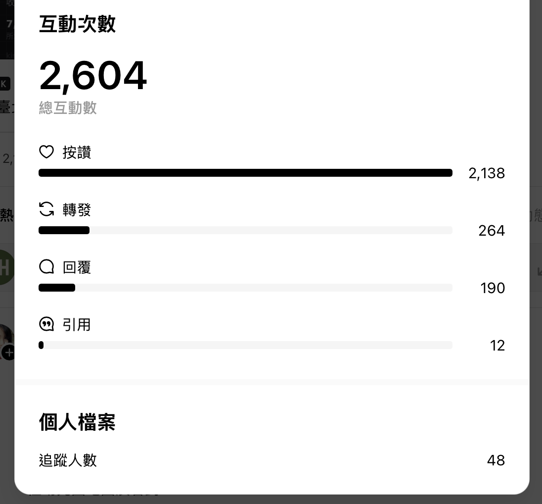
- 2,604 interactions — 2,138 likes, 264 reposts, 190 replies, 12 quotes
- 2,880 shares
- New followers: 48
Two numbers are worth pausing on.
The first is 90%. The account had almost no followers before this, yet nine out of ten of those 87k views came from the home feed — the algorithm actively pushing the post to strangers. The topic tab itself brought only 0.02% of views, but I tend to believe those two topic tags helped the algorithm decide who to push it to: parents already following preschool topics.
The second is 48. After 87k views, the followers who stayed: 48. Not a big number, but it still surprised me.
Traffic
On Plausible, over the five days from 4/7 to 4/11:
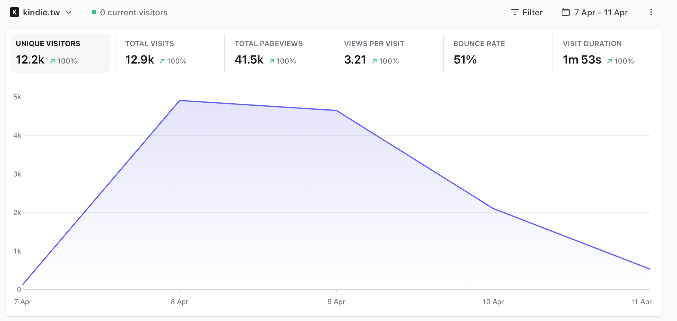
- 12.2k unique visitors, 41.5k pageviews
- 3.21 pages per visit on average, 1m 53s per visit, 51% bounce rate
- The peak came on 4/8 at roughly 4.9k visitors in a day; by 4/11 it was down to around 500
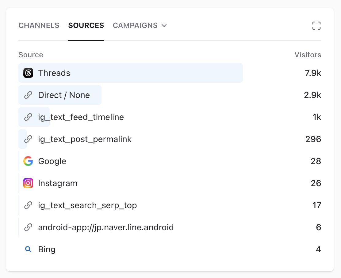
Sources: Threads 7.9k, Direct 2.9k, Instagram roughly 1.3k combined — and then Google, at 28.
The happy part first — 3.21 pages per visit is not a passing-by number. People were actually opening preschools, actually comparing; the core feature was genuinely being used. Which matters, because the compare feature is the tool my wife and I had wanted most.
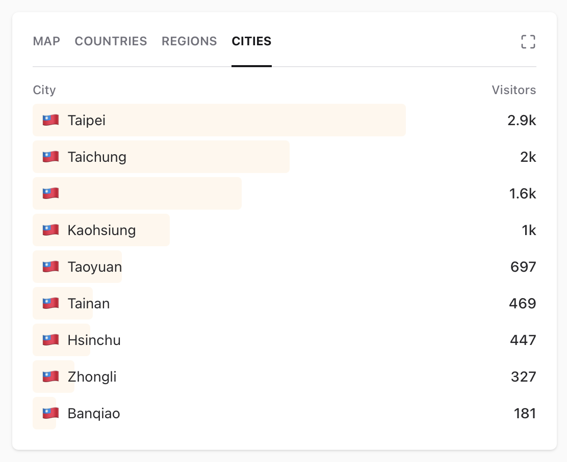
The city breakdown runs from Taipei to Taichung to Kaohsiung and on down — all over Taiwan, not just a Taipei bubble, though you can see the north leading by a clear margin. As for the 2.9k Direct visitors, my guess is that many were the post being forwarded into LINE group chats and elsewhere, then opened from there.
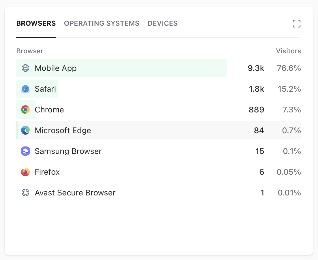
And one genuinely unexpected finding: 76.6% of visitors arrived on a "Mobile App" browser — the in-app browsers of Threads and Instagram — and with Safari's 15.2% on top, more than nine in ten people were on their phones, and probably mostly iPhone users at that. This one caught me off guard, because I had assumed most people would lean toward Google Chrome.
You can also see it in the curve: after launch, traffic peaked on 4/8 and then slid straight down. After that it leveled off — a few hundred a day, with around 20~30 visitors a day coming in to look something up. I think that's reasonable, because it's exactly how we behaved ourselves — parents dig intensively in the few months leading up to enrollment, and once the preschool is settled, chances are they never do that homework again. Or something pulls them back — a piece of negative news, a friend's recommendation, someone's review — and only then do they come look at a preschool's records and current state again.
Which is probably the next assignment: outside enrollment season, when a parent does need this, is Kindie worth coming back to — to use, to compare, to look things up?
After Launch
Through launch week, feedback from parents kept arriving. For example:
- Allow more preschools in a comparison — it started at 3, but they needed to compare across districts
- After a search, going back to the home page meant searching all over again; they wanted their previous filters kept
- The actual fees at some preschools didn't match what the page showed
- Some preschools they knew existed couldn't be found on the site
We updated as quickly as we could and put it back in parents' hands. Including:
- Two guides: registration timelines by county and city, and how the preschool types differ
- More preschools allowed in a single comparison
- A re-check of the data — for gaps that made preschools unfindable, and for fees or labels that weren't right
- Layout adjustments on mobile
And based on what the data was showing, we also added:
- A sitemap of 7,299 URLs, submitted to Google Search Console
- Schema.org structured data on preschool pages (EducationalOrganization, LocalBusiness)
Along the way we also added Google sign-in, so parents can save the preschools they're targeting and leave reviews for other parents to reference. One parent even asked for an infant-daycare version! To us, that's the best kind of feedback — it means the need is real, and people are hoping the same problem gets solved for them too.
Where It Stands
Three months and a bit later: the data keeps updating, and the site is quietly alive. Traffic has settled back down, and search is only beginning to accumulate. The question to answer next should be: what role can Kindie play at a parent's side in the days ahead?
Looking back at that week, though, the three things most worth keeping:
- The right content in the right community beats follower counts. An account with barely any followers got pushed in front of 87k views on the strength of one honest post.
- Social traffic is borrowed. 87k views converted into 48 followers, and the curve hit the ground within four days. Only two things stay: the 7,000+ pages sitting in search engines, and the parents who actually bookmarked the site.
- Data only matters if it can force a decision. The 76.6% of visitors on in-app browsers set the priorities for the redesign; Google's 28 decided where the next three months of effort would go.
Closing
If you happen to be looking for a preschool for your kid, give it a try: kindie.tw. If you find data that's wrong — or have any suggestions — you're always welcome to contact us.